Ever since Apple came up with iMovie for iPhone, the concept of shooting, editing and publishing all on a single device became a reality. Since then, many other companies have taken it upon themselves to offer similar functionality, with varying degrees of success.
This isn’t the first app Adobe’s released to allow you to edit on the go, but Rush feels the most polished.
- Want to try Adobe Rush? Check out the website here
The interface is incredibly clean and simple and is meant to be used in portrait orientation. Putting the phone in landscape merely allows you to play your project on a bigger canvas, but without any editing tools at your disposal.
You could switch constantly between the two, but frankly that would become frustrating very fast. Best to stick to Portrait and get some work done.
- Also check out the best free video editing software
Editing
When you first start a project, it looks like you’ve only got one layer of video to work with, but as you add more assets, like titles, graphics, and additional clips, you’ll notice you actually have access to four layers of video, and three additional layers of audio (in addition to the videos’ embedded audio), giving you great flexibility for a mobile device, without getting lost with “unlimited” layers.
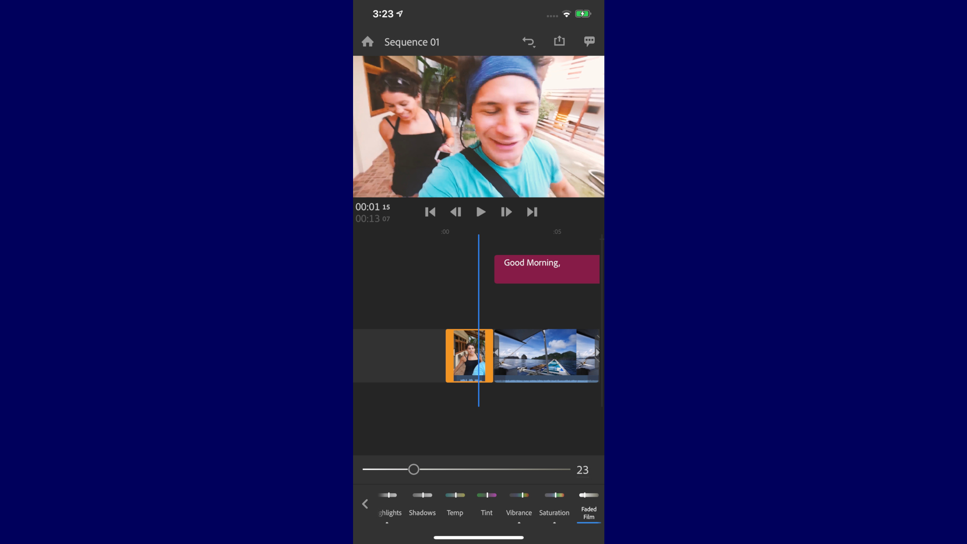
You have access to all the tools you need to perform simple edits: you can duplicate a clip, cut it, trim it, move it around, everything you’d expect.
You can also change your project’s aspect ratio on the fly. By default you’re working in 16:9, but you can flip that to 9:16, 4:5 or 1:1 at will.
Effects
This feature works in tandem with an effect we particularly liked: changing the aspect ratio may mean that the crop may now be off. You can of course pan and zoom to fix this, or you could use the Auto Reframe feature.
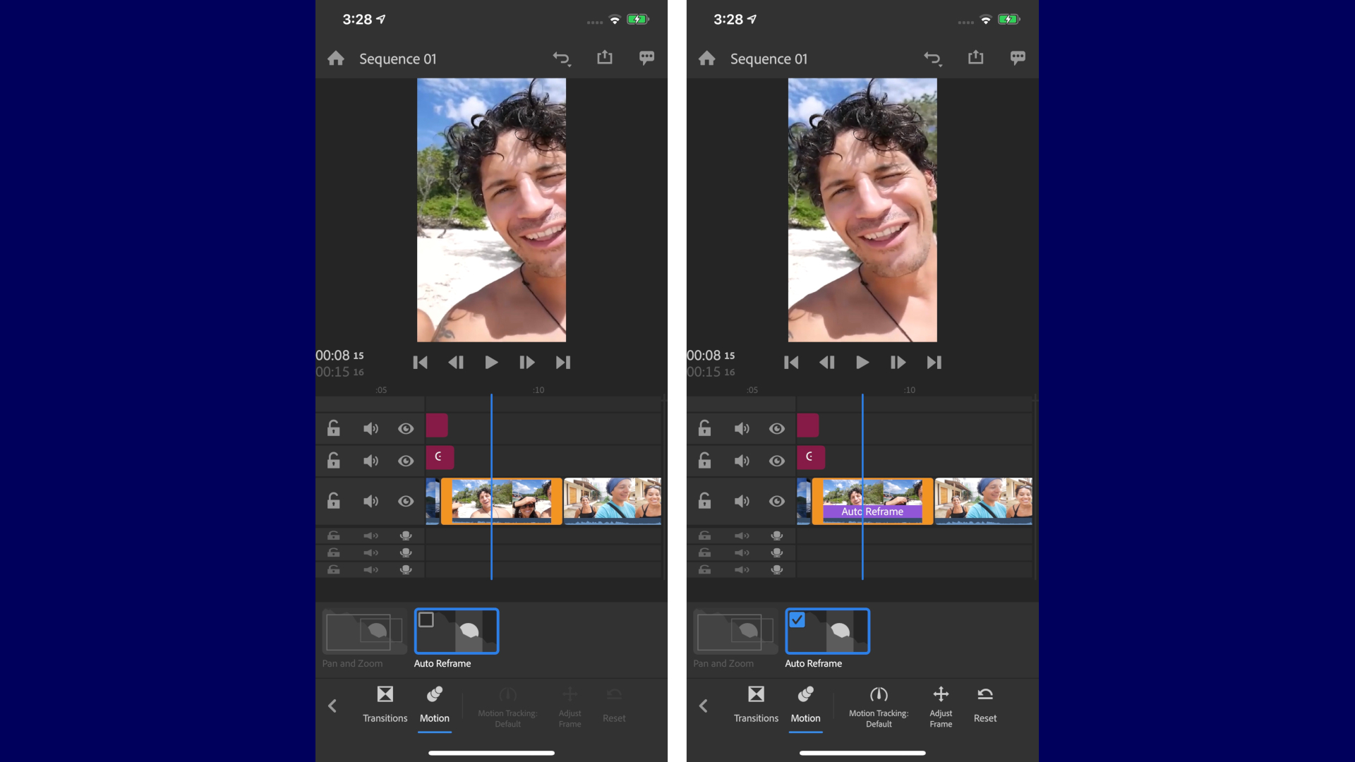
Selecting it allows Rush to analyse your clip and decide which section is the most relevant. It doesn’t always get it right - especially if there are multiple people in the shot - but when it works, it’s perfect. The clip tracks the right part of your footage for the duration of the clip. Don’t despair if it didn’t work: you can adjust what the clip should focus on with the tap of a button.
You also have a selection of colour filters you can apply to a clip, but unlike certain other apps, which give you a handful of effects without any ability to tweak your selection, Rush gives you full control. You can change all the parameters of a built-in preset to get just the look you’re after, and then create your own preset out of that, to easily apply it to other clips or projects.
Graphics
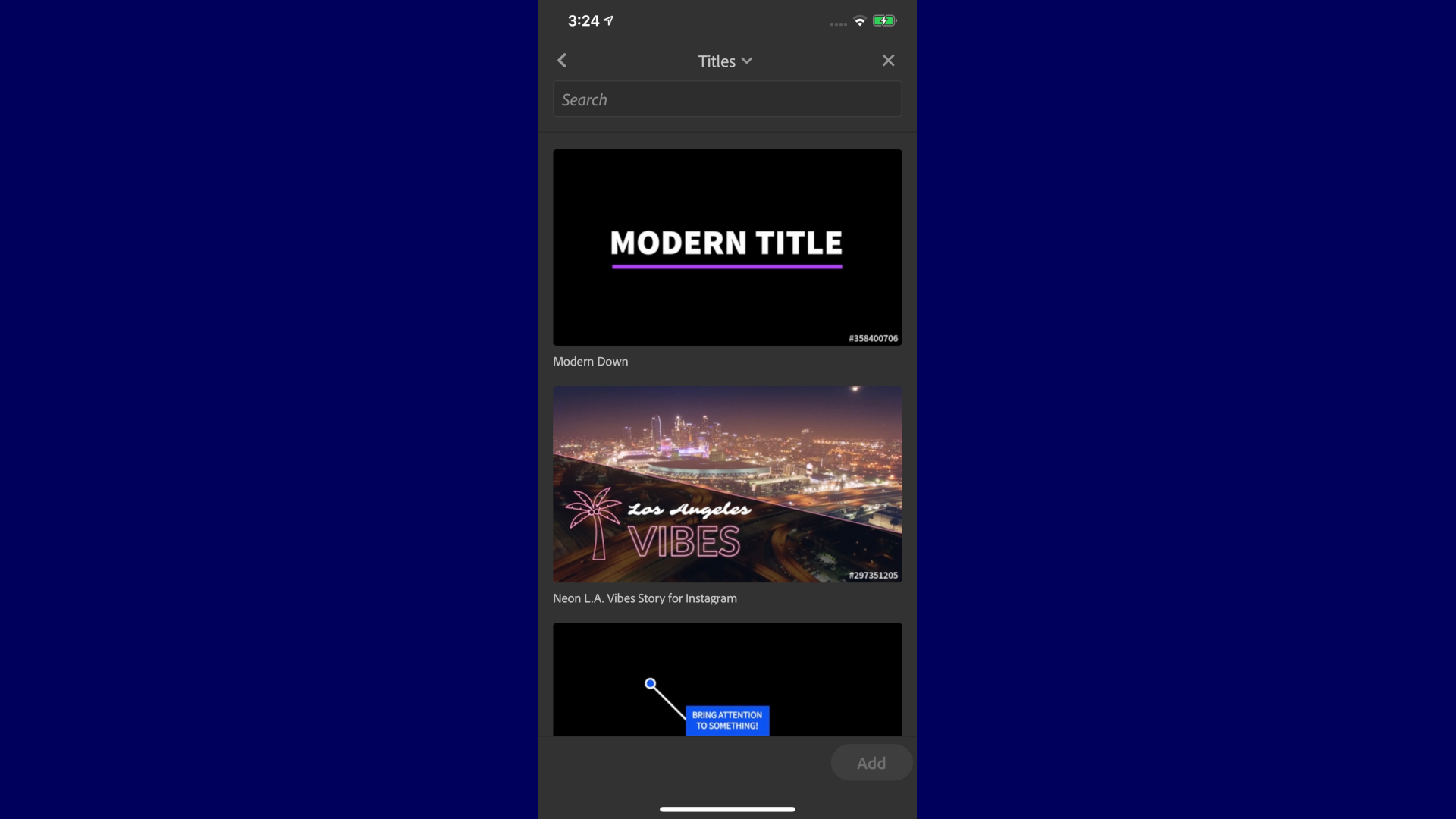
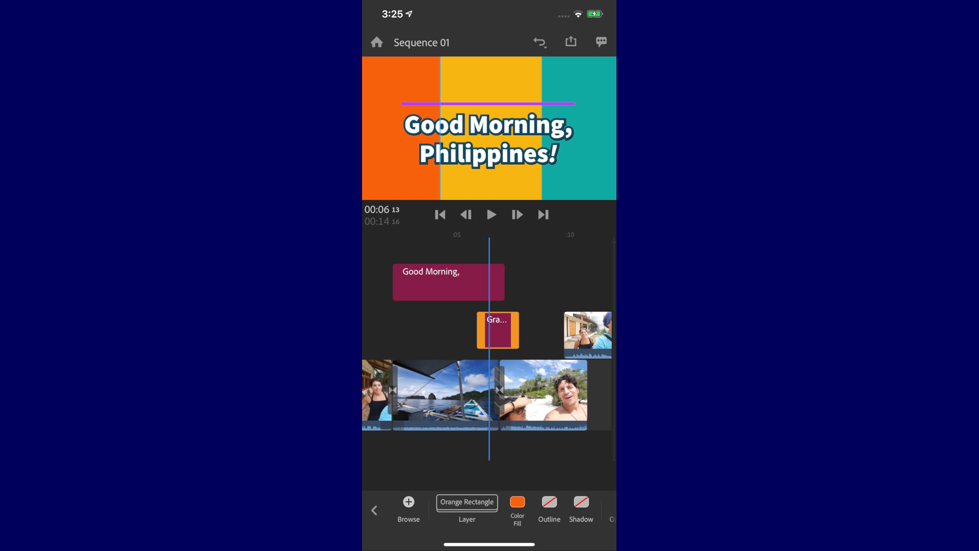
Your customisation options extend to title cards and graphics. You have dozens of each to choose from, so many in fact, we gave up counting them. Which is great as having options is a definite benefit. However there is an annoying trait to Rush’s options: all these graphics and titles are animated, yet you can’t seem to be able to preview said animations from the selection window. Tapping on one selects it. A long tap does nothing. Nor a hard press. So the only way to preview it is to add it to your project, and if you’re not happy with it, you have to delete it and start the process all over again.
This is probably the most frustrating aspect of this app that we’ve encountered, and it’s a shame because all the graphics and titles we chose had interesting and sharp animations, but who has the time to add dozens to graphics to a project to choose the right one?
Once you’ve settled on a graphic, you again have compete editing control. You can choose a different font, alter the character and line spacing, change colours, apply a shade to the outline, add a shadow, and when you’re done, you again have the ability to save what you’ve created into a template for later use.
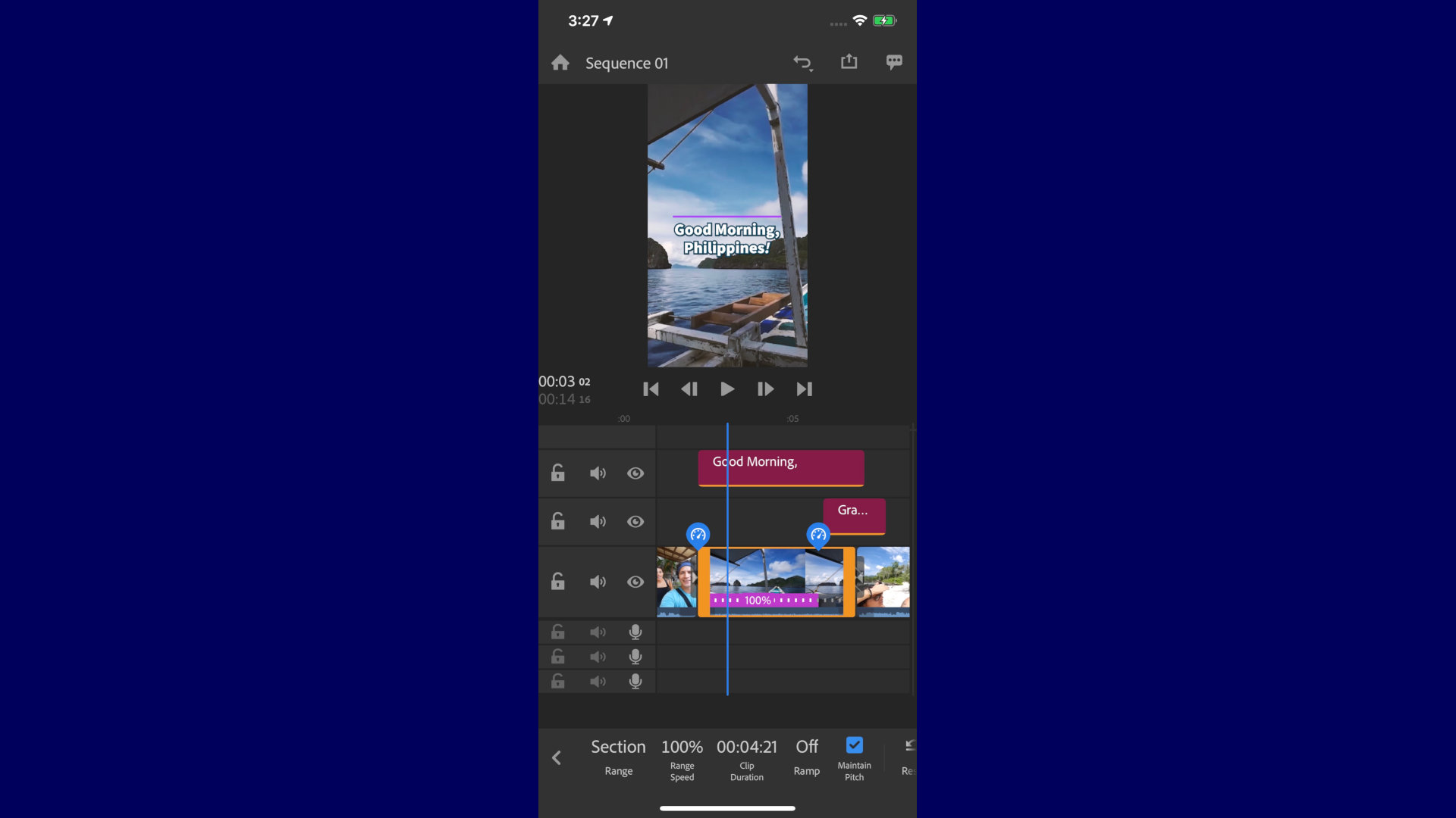
There are a few additional features, such as speeding up or slowing down a clip, making sure the video fills the frame, or is resized to see all of it irrespective of the project’s format (the former is selected by default). You can also alter a clip’s rotation or opacity, among others, and you even have a handful of audio filters, which ends up with quite a feature rich video editing app for your mobile phone. Not too many to get overwhelmed with, but enough to hopefully get your clips to look exactly as you want them to look.
Creative Cloud benefits
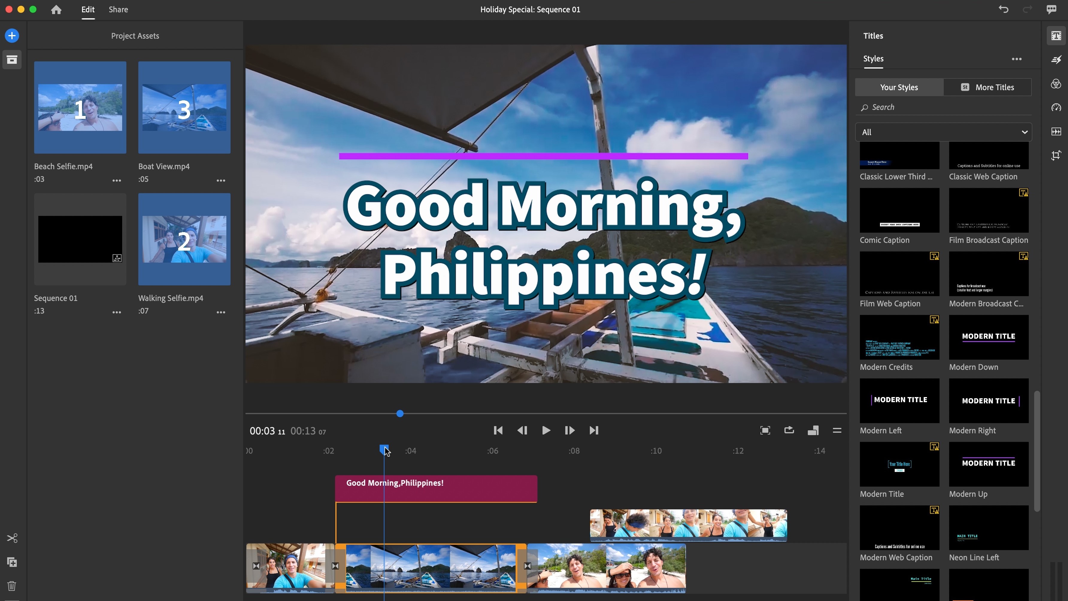
And with all of this in the palm of your hands, there’s actually another benefit to Adobe Rush. If you subscribe to Creative Cloud and have signed into Rush via your Adobe ID, you’ll gain the ability to use Rush on your computer - be it a PC or a Mac. You won’t gain any additional features, but you’ll be able to carry on editing the projects you started with on your phone. Any change you make on one device will be reflected on another.
And should you wish to go a step further, you can open your Adobe Rush project right inside Adobe Premiere Pro. This is a one-way trip though. Any changes you make there won’t be reflected in the Rush version of your project.
When it comes to sharing your work - Rush lets you save the completed project as a file on your device, or you can export it straight to YouTube, Facebook, Instagram or Behance.
Final verdict
Adobe Rush is feature packed yet the interface is designed to make it look clean and sparse. There are numerous options offered to you, or just stick to the default presets. This makes for an extremely versatile app. The fact you can also use it on a computer, and seamlessly import projects into Premiere Pro is but icing on the cake.
You don’t need to be part of the Adobe Creative Cloud ecosystem to make full use of its features - subscription is but an added benefit to an otherwise very well designed app.
- We've also highlighted the best video editing software
from TechRadar - All the latest technology news https://ift.tt/2CHZVyk
via IFTTT
0 التعليقات: