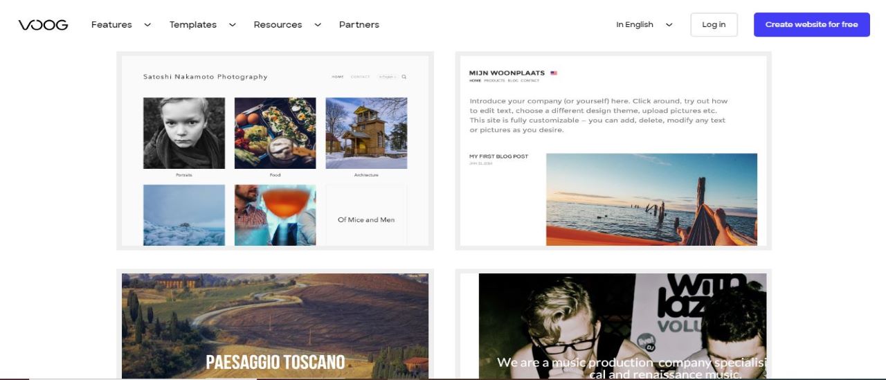
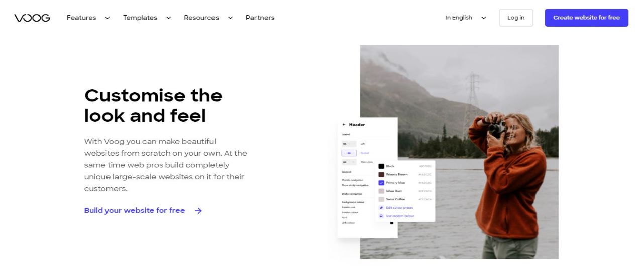
Voog is slightly different from other web hosts. Most website builders focus on ease of use and simplicity – in short, delivering a service that even the least technical home user can handle. And that's not necessarily a bad thing, but it could leave more advanced users wondering if the builder has the power they really need. Voog is simple and straightforward, yet the website also highlights its many pro users - businesses, developers, designers and more - when you access its landing page.
- Interested in Voog? Check out the website here
Professional extras include support for up to three website languages, full access to CSS and HTML, an API and developer tools for in-depth customization, and an online store.
- Also check out our roundup of the best website builders

Plans and pricing
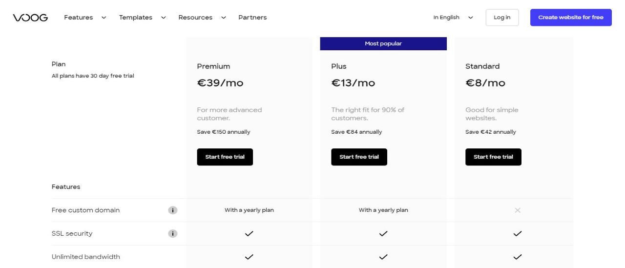
Voog offers a 30 day free trial, and you can easily cancel at the end if you need to. The free trial is a great way to test any of the plans before committing to a yearly subscription. There are three main plans on Voog’s website.
The Standard plan is $9.32 per month and comes with an SSL Certificate, unlimited bandwidth, and website analytics. The downside is that this plan doesn’t include your own domain. However, this is a great plan for anyone creating their own blog or showing a portfolio.
The Plus plan costs $15.15 and includes your own domain name, unlimited pages, SEO tools, and the ability to create an online store. It also comes with up to 20 GB of storage space and you can add unlimited contributors.
The Premium plan is $45.44 per month and comes with all of Voog’s biggest features. There’s access to custom SSL Certificates, a redirecting tool, and unlimited storage space. This plan works great for anyone who is running a larger business or wants unlimited storage for an online store.

Interface
Even when you start exploring the interface, it remains very compact. Tapping the Add button at the bottom of the screen displays small icons for the eight widgets that you can add to a page: a text box, image gallery, video, map, form, embed box, social bar, and a Buy button.
This is far more basic than some of the big-name competition. Wix, for instance, has a host of galleries, buttons, frames, forms and more, all displayed with thumbnail previews to help you find what you need. Voog is much more stripped-back and leaves you to do more tweaking and customization to achieve the effects you need.

Features
Our favorite feature provides a simple way to work on the site with others. You're able to send invitations to friends or colleagues and give them editing rights over the project, allowing teams to collaborate in a secure way (no more sharing of passwords). This could be a very appealing feature for many business users, and it's not one you'll often find elsewhere.
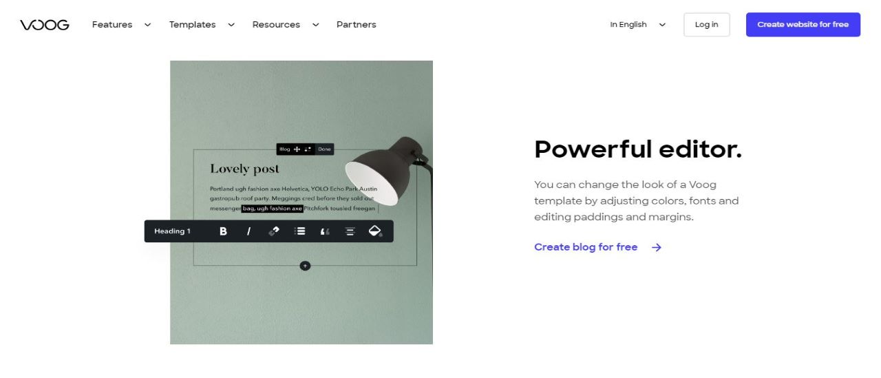
The Voog editor does its best to stay out of your way, a welcome approach which brings all kinds of benefits. There are no complicated menus to confuse beginners, no overweight toolbars hogging valuable screen real-estate, and you can browse your template as though it was a finished website. Clicking a menu link doesn't give you fifty navigation options, for instance – it just takes you to the linked page.

The editor gives you some control over layout. Objects can be placed above or below each other. Images are a little more flexible and Voog lets you place them in various parts of the page, but that takes a little getting used to: as you drag a photo, sections are highlighted in blue to indicate where it will end up. As you move the mouse left or right, you can instruct Voog to place it either side of a text section, for instance.
A nice touch is support for multiple languages. In a few seconds you can set up your site to, for example, support English, French and Spanish. These options are available from a menu, or you can even have the site automatically detect the language from the visitor's location.
The competition
There are many website builders out there - Jimdo, Squarespace, and Vistaprint are just a few. Website builders sometimes struggle with blogging, and even basic tasks like adding a new post can take some work. Voog avoids that in the simplest of ways: once you've chosen to add a new post, you just enter your content on the page where it will be displayed. There are boxes for your title, an excerpt, body copy, tags and more, and you can complete them just like any other web page element.
Voog's sophisticated text control gives you plenty of options, as we mentioned earlier. You can set text font, styles and alignment, enter lists, insert tables, images, videos, maps and more. If that's not enough, you're able to add any of the components you can include on a regular Voog web page: galleries, forms, social buttons, etc.
Final thoughts
Voog's easy-to-use interface and powerful editing tool make it an ideal website builder. The 30 day free trial is great for anyone who wants to test Voog and try out the templates. The plans are on the more expensive side, but the interface is fun and easy to navigate. This is an ideal website builder for anyone new to sharing their ideas online.
- We've featured the best small business website builder
You might also want to check out our other web hosting buying guides:
from TechRadar - All the latest technology news https://ift.tt/2Gmvfoa
via IFTTT
0 التعليقات: