Incomedia’s WebSite X5 aims to make website creation easy. Rather than work from a web-based interface, WebSite X5 is actually a downloadable app. In doing so, Incomedia have cut themselves off from a section of the market, as the app is Windows only. However, if you’re going to work using a desktop or laptop, this comprises the vast majority of potential users.
Downloading the app is free (the free version is called “Go”), but you will not get access to all features without paying for them. Still, this gives you the opportunity to test the software out and see if it would work for you.
You get 15 templates to choose from, the ability to create up to 10 pages for your website, an integrated FTP client, and access to the support team.
The main omissions to the “Go” version are blogging and e-commerce tools, which are really the most essential ones for any burgeoning business these days. If you need to try these out, the developers offer a 30-day money back guarantee for their paid-for software.
- Want to try WebSite X5? Check out the website here
For $80 (£60), the Evo package gets you access to over 100 templates. You can create an unlimited number of pages, the aforementioned blog and shopping features are included, as are analytics, SEO functions, and an online control panel.
The ability to create responsive websites - pages that move their content around depending on the size of the screen viewing them, something which is expected from modern websites - is also only present in the paid versions.
You’ll also have access to any updates for one year.
A Pro option is available for $220 (£170). Features include all of the above, plus the ability to sell digital products, offer discounts and coupons, customer registration, database integration, more analytics and SEO features, the ability to auto detect the browser language and resolution, as well as management and backup options.
If you want to create a full online retail experience, it’s clear you’d have to go with the Pro option, and fair enough. But to restrict digital sales to that version and not offer it to Evo customers feels unnecessarily mean.
Do note that you need to download the app connected to the plan you’ve chosen. If you tried out Go, and later paid for Evo, this won’t unlock new features in your Go app. You have to grab the Evo one instead.
Getting started
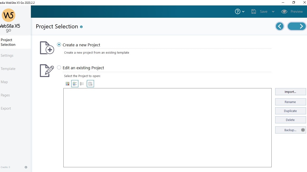
Whichever app you’ll be trying out, launch it and click on ‘Start’, top right of the interface. From there, you’ll be able to open an existing project or start one from scratch.
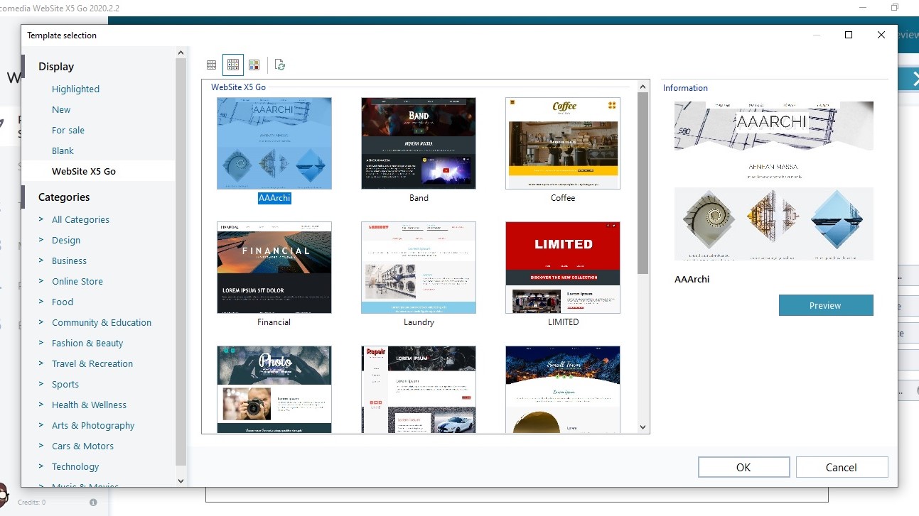
When browsing through the templates of one of the paid apps, you’ll notice quickly that although you’ve gained access to well over 100 of them, there are still over 50 which you can only use by spending credits - which is a form of in-app purchase.
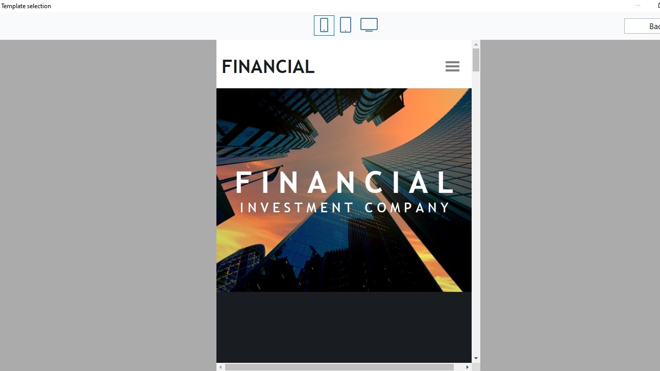
You can however preview all of them to see how the layout feels, and can also effortlessly switch between phone, tablet and computer screens to see how the responsive interface works.
The templates are broken down into categories which helps you narrow down your choices, but it’s disappointing that there isn’t a search field to focus your decision further.
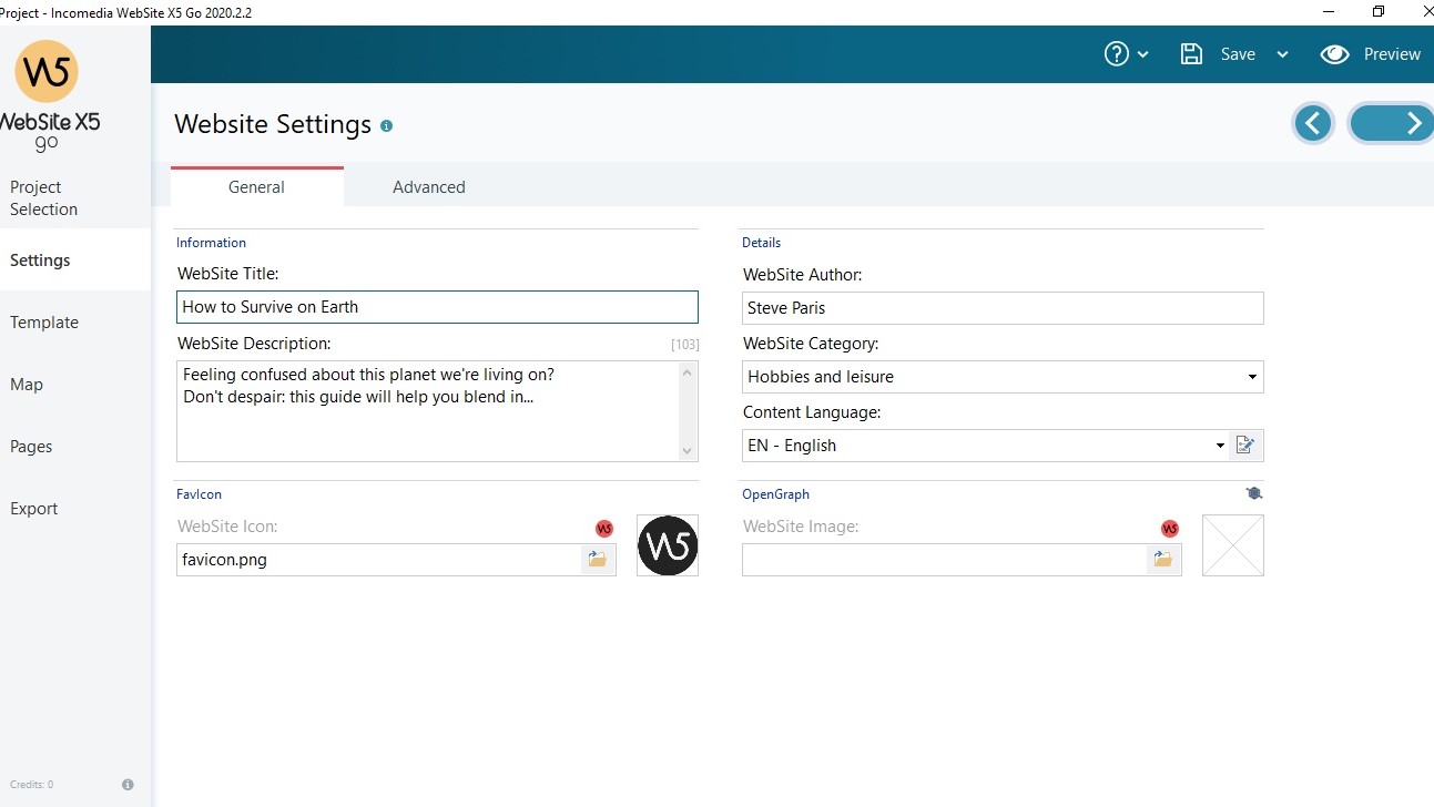
Once you’ve chosen a template, you get to enter basic information, such as your site’s name, its author, a brief description and so on. Paid apps also have access to a few advanced features like setting up blog details, or a list of products you intend to sell online (more on both of these further down this review).
By default your site is designed to be a responsive one, ie, the information on the screen will resize and reposition itself to match the available space on the visitor’s screen. You can alter the default thresholds should you wish, or elect to keep your site a “Desktop” one, ie, how it is seen on a computer will be how it is seen on a mobile device (which is more of an old school approach to website design, and not really what most people expect these days).
The most interesting part of the setup process is seeing how pages will be assembled. They are comprised of blocks, where text, images or other content will be added.
The page can be broken down into horizontal blocks, or vertical ones (think of those as columns), allowing you for instance to place images in between text sections.
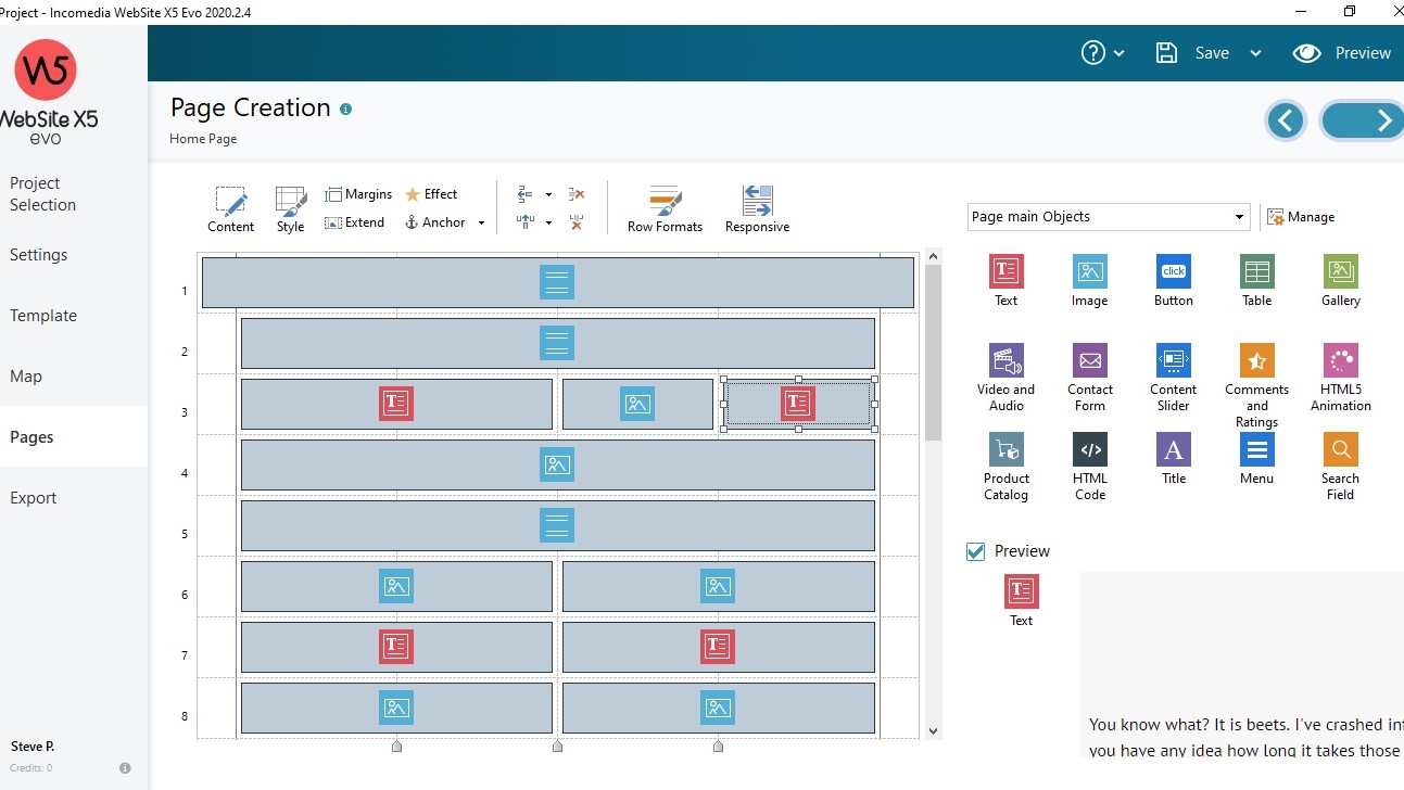
You can resize each block manually, and break down the page vertically into at most four columns (the templates are by default broken down into two to make your information easier to see on a smaller screen).
To the right of the design area are the available blocks you can use, from text and images, to video, animation, product catalog, a search field, comments, image galleries, and more.
Editing pages
Great though this may sound, you might be confused at first how to actually build your site. But that’s because the creation concept isn’t as WYSIWYG as you might expect. In fact, the editing interface is pretty far from WYSIWYG.
You edit pages by going to the Map section. Double click on one of the pages, and you’ll be presented with the breakdown of the page described above.
You know there’s text in some places, images, videos, etc in others… To see what the current design looks like, click on Preview, top right of the interface.
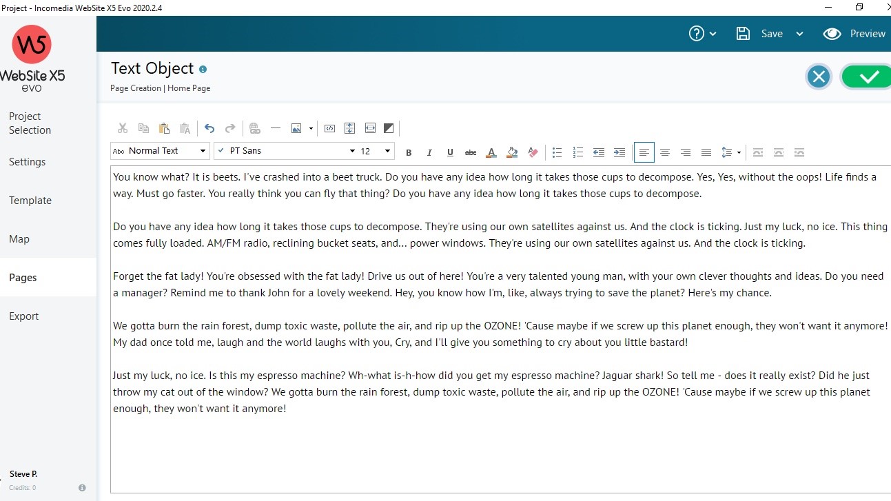
To edit any section, double-click on it to open up a floating window, ready for you to write what you want in it. Text boxes offer the usual range of editing tools and also include the ability to insert images among your paragraphs.
You have to perform this action for every section and it isn’t clear at a glance which ones have been done and which ones haven’t, which can get a little tedious and confusing over time.
There are no editing tools for images, so you need to have them properly formatted in another app prior to adding them to your pages.
The video and audio object allows you to add media stored either on your computer, somewhere else online, or by adding a URL from YouTube or Vimeo.
The big problem with working in this way, is you can’t tell how your page looks until you hit Preview. If you’ve added too much text in one column, there will be a large blank space on the adjoining one, unless you go back and edit what you’ve written, then go back to Preview to see how it now looks… and repeat the process over and over again until you’re satisfied.
As an editing exercise, this does feel extremely antiquated, unnecessarily time consuming, and frustrating.
Blogging
Working on a blog isn’t done from the Map section, even though there’s a ‘Blog: Article Page’ menu there. Instead you need to go to Settings, choose the Advanced feature, and click on Blog. Another unintuitive interface decision.
The Blogging interface is more traditional. You can type away, creating content, inserting images into your article, resizing them, etc.
Once complete, WebSite X5 takes care of the rest, populating the main blogging page with articles as you create them.
This worked very well, and they are a few customisation options, but it does feel a little basic, especially compared to the competition, some of which offer blogging for free.
E-commerce
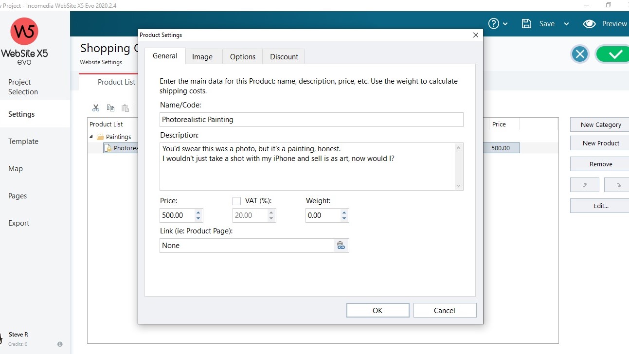
Adding products to your store is also done via the Settings page, and by clicking on Shopping Cart.
You can add a description, photos, set a price, even include various options for products which might affect the price and/or weight (important when calculating shipping).
There doesn’t seem to be a way to import a product list though, which means adding each item one at a time. Depending on how much gear you wish to sell, this could be a dealbreaker.
The financial side of things is done by default through PayPal, but if you use a different provider, you can copy and paste the required HMTL code into a designated field instead. Obviously PayPal is meant to be the easiest and seamless option.
Support
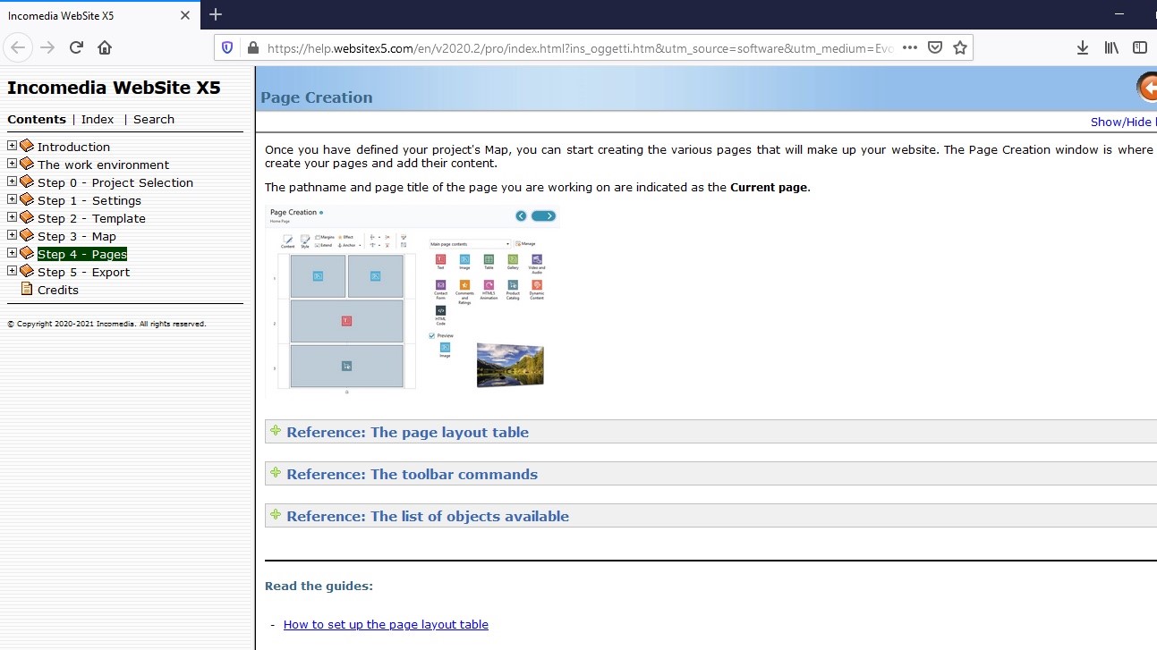
If you get lost at any time, click on the big question mark icon, top right of the interface. This’ll take you to an online resource whose aim is to explain every aspect of the app through a series of articles. It’s broken down into eight chronological sections, and if what you’re looking for isn’t easy to find, the search field will help you narrow down your query.
Final verdict
There’s a lot of interesting features, including the ability to easily animate sections using HTML5. The blogging tool works well, but the e-commerce side of things feels light on features, especially for a paid product. But what lets WebSite X5 down the most is the inability to see your page as you’re editing it, making formatting tricky if you have a lot to say and want to create a more complex page format.
- We've also highlighted the best website builder
from Future - All the latest news https://ift.tt/2VoT03j
via IFTTT
0 التعليقات: